Connections Lab: Project 1
Key concept(s) and/or intention(s) driving the project. Include any noteworthy inspirations or influences
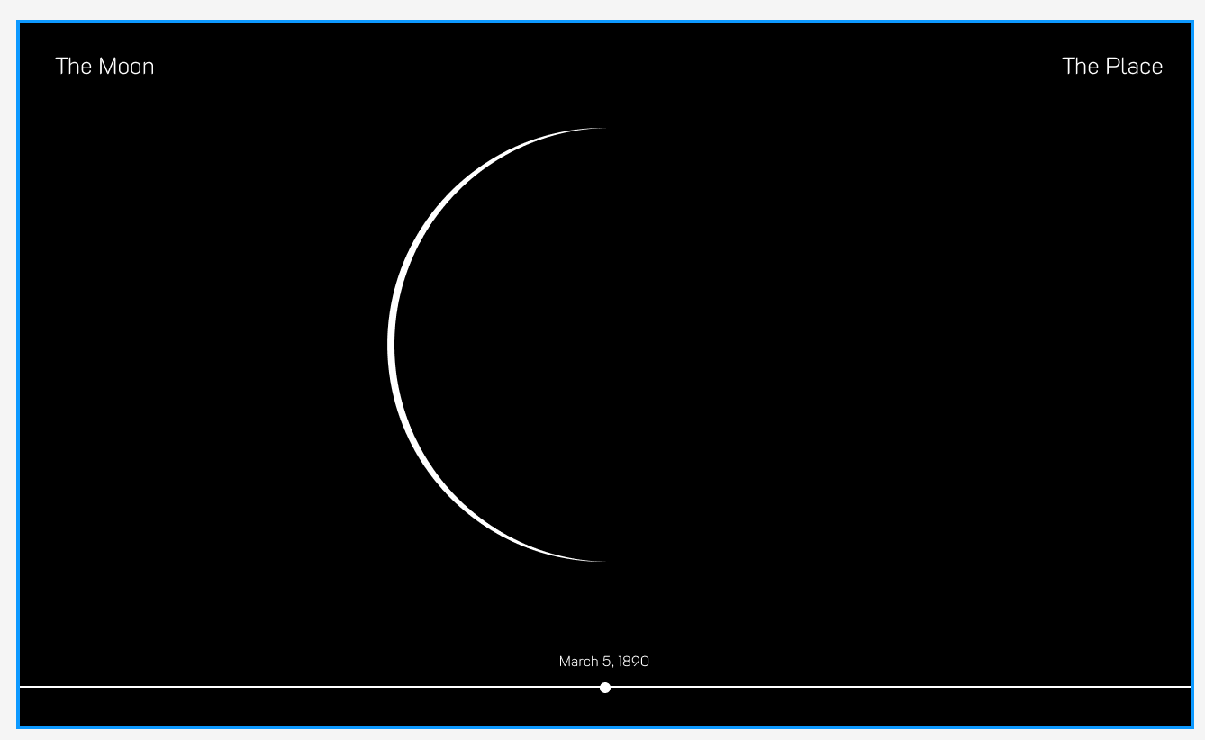
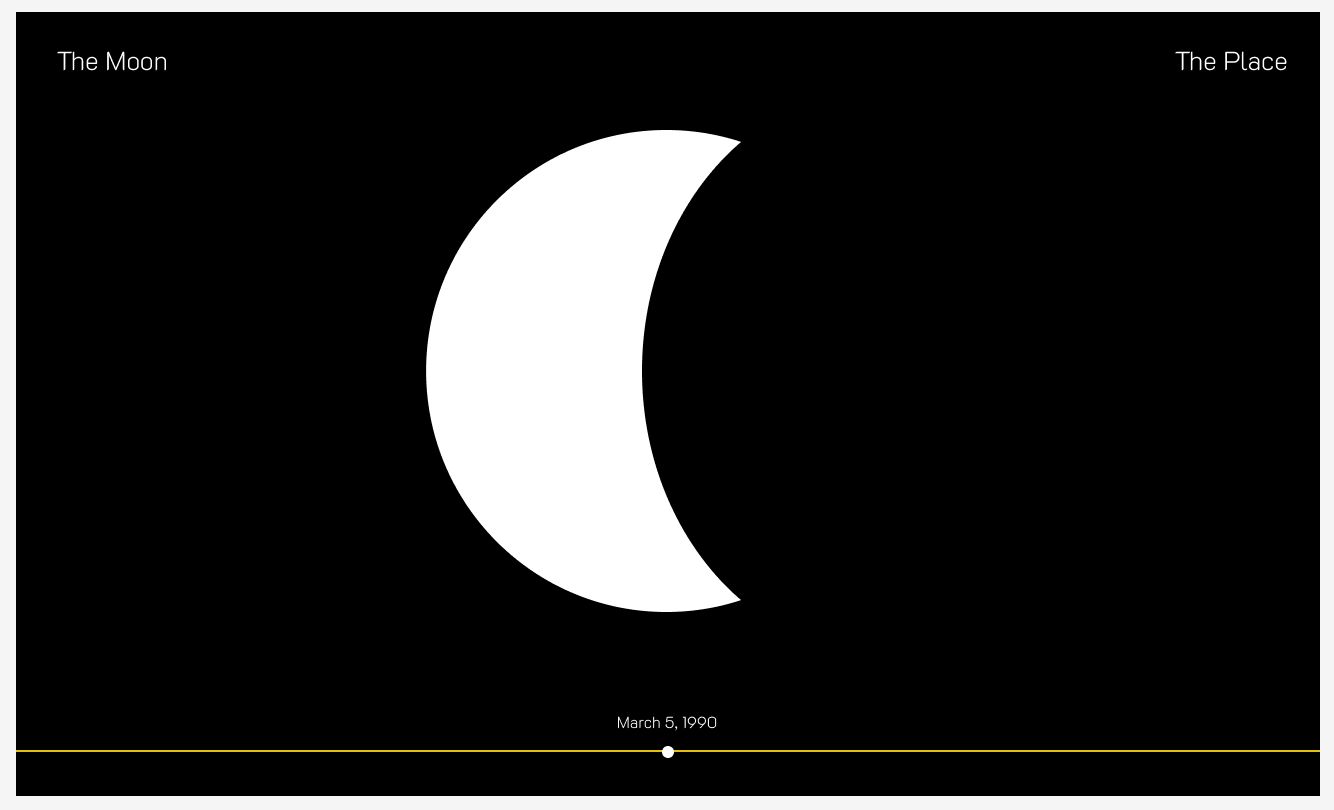
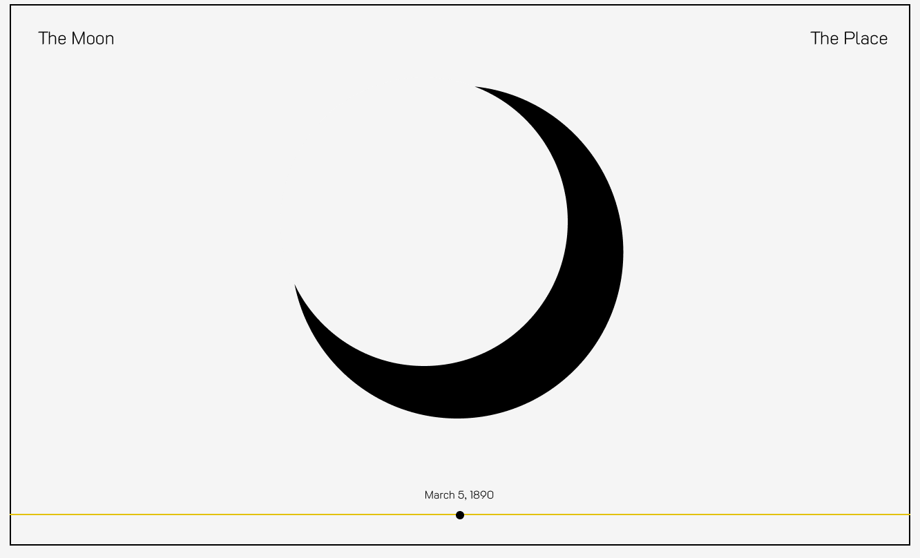
A big driver of the project was wanting to see some of the stuff I did in creative coding linked to data. Ultimately, this didn’t happen, haha, but that was the main driver, to see if any of the graphic design-y things I did in creative coding could be linked to data, and if anyone could interact with it. The idea of phases of the Moon seemed simple enough to achieve.
Production decisions (i.e. technical, design, creative, etc.)
I purposely made my site extremely 2-D and simple, because I wanted to focus on understanding the architecture of the different components (see below). I even made a decision halfway through to not engage with any shapes and only link to different images that were numbered. This also made it easier to figure out if things were “linking” the way I wanted them to. I also de-scoped the data aspect of the project, and chose to just try to link a .json that I had created (static data). Once again, I was just trying to focus on understanding the architecture.
I also happen to like cleanliness, so the aesthetic worked for me.
Major challenges and solutions (i.e. the most difficult aspects of the project for you and how you attempted to address them)
one major, major challenge for me was understanding the “environment” and how exactly everything we were interacting with interacted with each other. in the creative coding class last term, it was somewhat easy to understand that the p5 editor was a web editor for javascript and used a library of “terms” to publish to the web. in this class, we use visual code studio to write HTML (markup language) to lay out content (almost like an outline for a paper) and then CSS (style sheets) to format it (I started thinking of it in graphic design terms where once the content was laid out in an outline format, someone would come and arrange it like a collage based on sections), and then js (javascript) to handle the interactions (clicks, drags, etc.) on the page.
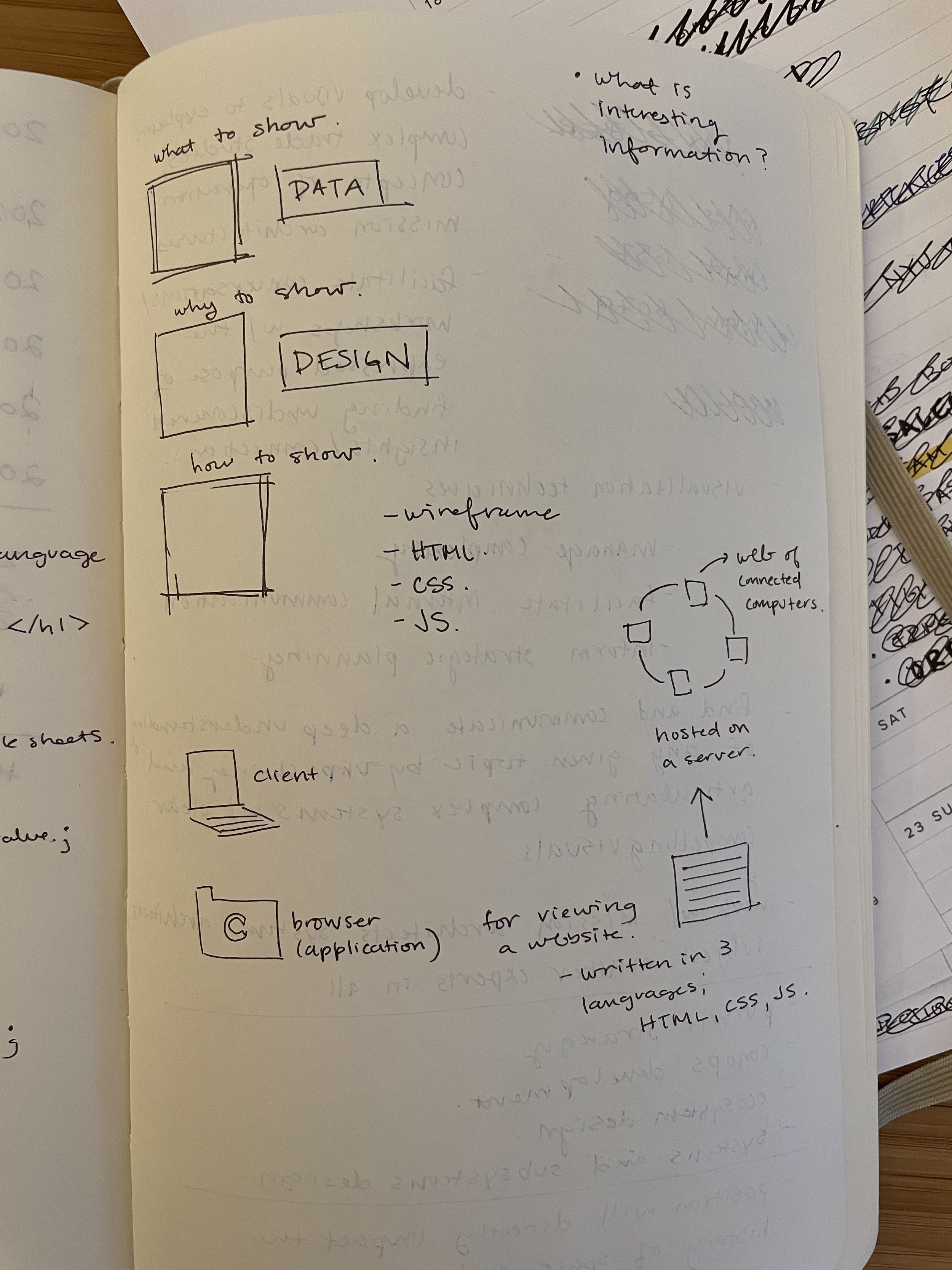
this was the moment that things really derailed for me; for whatever reason I just couldn’t make my brain understand how javascript was meant to work with HTML and CSS. I couldn’t even formulate a question to try to get it answered. And then a few other terms started popping up like DOMs and APIs and I was truly lost. For better or worse, I find it almost impossible to move forward on things if I don’t understand why I’m doing it, so I spent some time just diagramming things out and reading material to figure out the “ecosystem.”
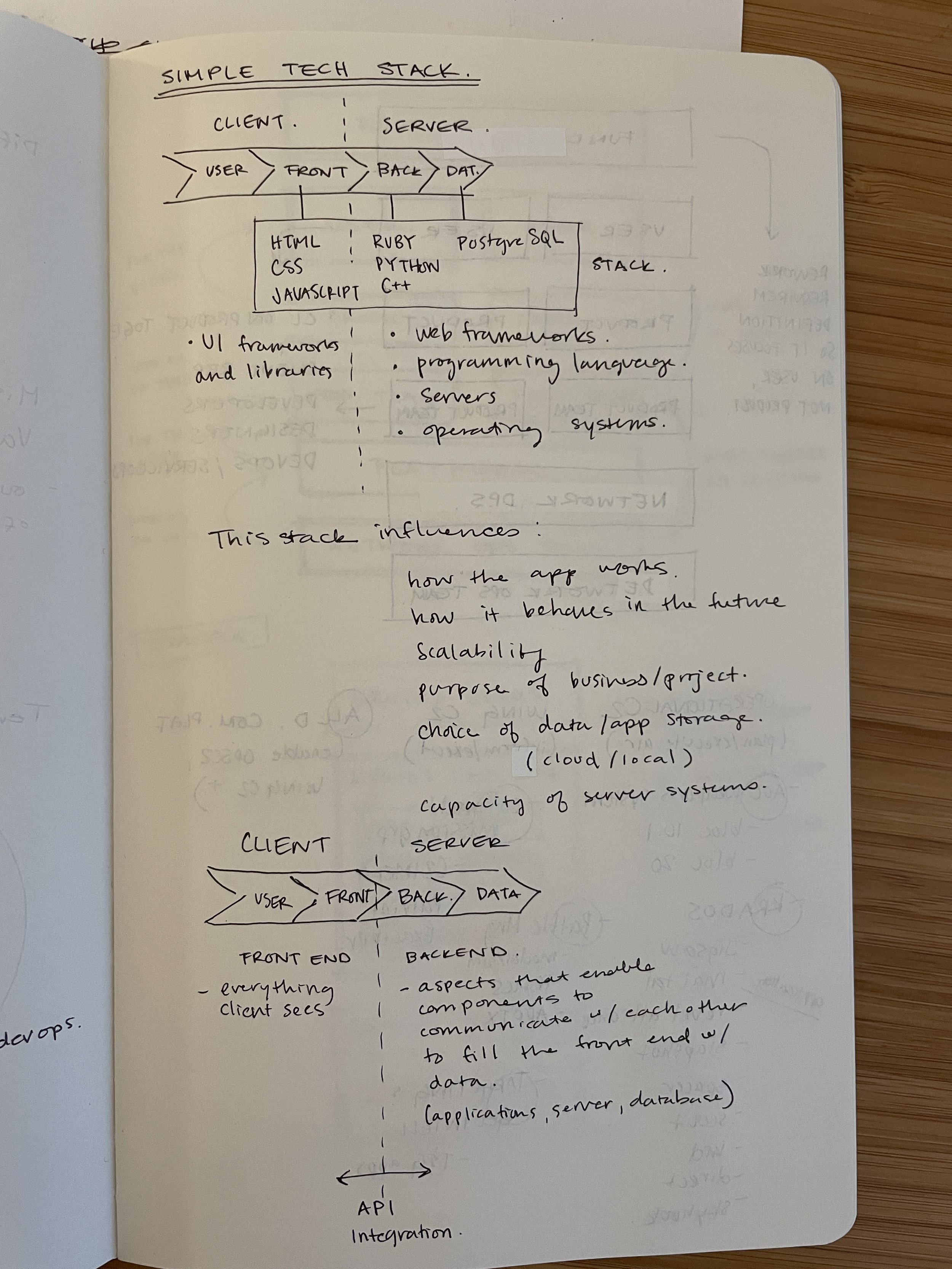
What ended up really working for me was this a whiteboard diagram that visually laid out how a system works, along with a few other bits of research into terms, and a diagram of what was meant by a “full stack” and how it relates to front end, back end, client side, server side, users, and data, etc. After I understood this, it became a lot easier to know where to start, how to troubleshoot, and what the architecture of the project might look like. I started to think of each component as elements on a stage, with some being in front of an audience, some of it being backstage, and little tunnels so stuff backstage could come forward seamlessly, etc. I dunno why but this helped me.
Lessons learned as well as potential next steps if work on the project continues
one big lesson I kept running into not necessarily with code but with publishing, etc. was the naming of files. I have a way of naming files that usually includes spaces and underscores, but I continued to run into random issues wherever I used it. I think from here on out it’s dashes and/or no spaces but with Caps.
Any relevant references/resources
credit to Brian for big help
credit to Craig’s slider code: https://codepen.io/craigprotzel/pen/XWqENXB
Link to the project (Github Pages)
Link to the project code (GitHub repo)
